Happy New Year EVERYONE! Sorry its been a while – I decided on a little December detox in terms of social media which has given me time to plan a makeover of my bedroom. Ever since I turned the dining room back into a spare bedroom back in September (BYE BYE DINING ROOM, HELLO NEW BEDROOM!) I have had a strange jealousy that the guest room is nicer than mine! Random?!


Bye Bye Blue
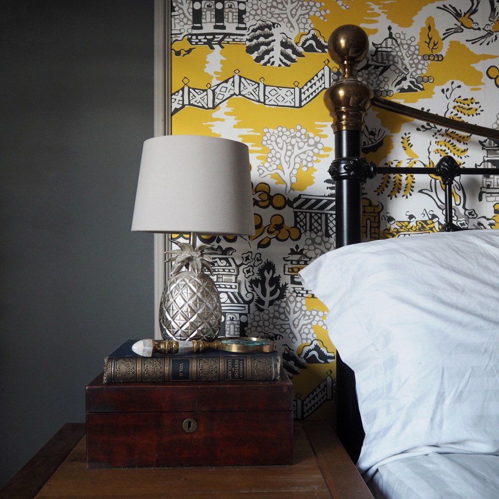
I loved the wallpaper when I found it and whilst I still do, I think homes evolve. This was one of the first rooms I ever decorated when I moved in and, 3 years on, no longer feels as polished and styled as the rest of my home. The room felt just a bit disjointed and needed pulling together in order to best display my beloved pieces, one of which is my turquoise chest of drawers. This unease about the room led me to look at lots (I genuinely do mean loads!) of wallpapers and after a lot of thought (and many cups of tea!), I came to the decision that it was time to bring back a bit of YELLOW. My love of yellow was the subject for my first ever blog post two years ago now – ‘Daring to be different with’Dayroom Yellow’.

When it came to decision time I opted for the gorgeous Enchantment Luzon print in lemon and grey by Thibaut. This costs around £60/£70 a roll but makes a big and bold statement, and despite me usually looking to work on a budget, this actually worked out quite cheap for me as I only needed one roll to complete the look in my project. I got my roll from wallpaperdirect.com in a Black Friday promo deal for £45.00 but they currently have it on sale for £48.00. I was keen to avoid a full feature wall and so worked out that I’d only need three strips for behind the bed to create a feature, whilst avoiding a full end to end feature wall. After mapping it out and experimenting with different feature options I decided to panel them all together, rather than going for three separate strips.


With the wallpaper chosen, purchased and delivered I finished my cup of tea and headed to B&Q with excitement (sad I know but I just love paint!). The Valspar colour match capability has to be one of the top 10 inventions in my opinion! I had initially decided to keep the same grey colour that already exists on the other walls and simply repaint behind the bed the same colour, however I heard the devil on my shoulder telling me “Go bold or Go home”!!!

And with that I had the black shade from the wallpaper colour matched for the wall and the grey shade selected for the wood battens (just a tester pot was necessary for those). As I stood with my wallpaper sample at the counter waiting for the paint to mix the man next to me in the queue nodded politely with his colour card (cream) and so you can imagine the look of horror on his face when the mixing of my colour had finished and the guy opened my tin to show me the freshly mixed colour of the black paint!! (I thought he might actually faint!)

I had stripped the wallpaper off a couple of weeks ago with a one of the steam cleaners you buy for home and garment cleaning- I would definitely do that again as it was so quick and easy. So when I got home it was ready to get painting – well, after I had popped the kettle on and got a bit Whitney on the go on the speaker. Valspar is such a great paint to work with and only needed one coat (probably the dark colour helped there!). So whilst we left the wall to dry we headed out to collect my bargain £7.50 plant stand. which I sourced from ebay.


GO BOLD!
Plant stand collected and painted (in the same black as the wall) we set off back from the Leeds house to York early to get the wallpapering done and dusted, so that I could spend the rest of the day on the faffing and rejigging (my favourite part of any decoration).


Plant Stand Painting
The wallpaper soon went up, and to keep the centre perfect we started in the middle and work out to the sides (not sure if this is recommended by the pros but it worked for us!). To finish the paper panel off I have tacked a decorative batten to the edges to give depth, rather than it be flat to the wall. The batten was painted in the tester pot of the colour matched grey in the wallpaper.


With the decorating part complete I replenished my Yorkshire Gold tea and began the faffing of the room. This was mostly creating my wall of blue and white plates to tie in with the oriental themed wallpaper as I love blue and yellow together. There is something strange but quintessentially British about blue & white china – ironic i know since most are willow pattern. In between the plates I have scattered gold bees (well these are actually Halloween flies that I have sprayed gold).


To the other side by the mirror I added my Rory Dobner plates to the collection of white animal heads, along with some more bees from the Ikea Christmas range, creating a eclectic mix. That was mostly it for the reshuffling as the furniture stayed where it was – apart from the addition of my the plant stand and some new cushions. I picked the yellow pom pom cushion up in Homesense (£12.99 each feather filled) and the grey were from Ikea (£9.40 each with a feather pad).


For me decorating gives me a great sense of achievement, especially when it changes your whole feeling towards a room. I had started to reach the point where my room had become a bit of a hotch potch of stuff that was no longer lovingly curated. I didn’t like that room and often thought shall I just move into the spare room.


So for something as simple as one roll of paper and a tin of paint to change a room dramatically is always something that memorises me! However there is a downside fast approaching – this was the last room I didn’t love and so where am I going to decorate now?!!


Leave a comment